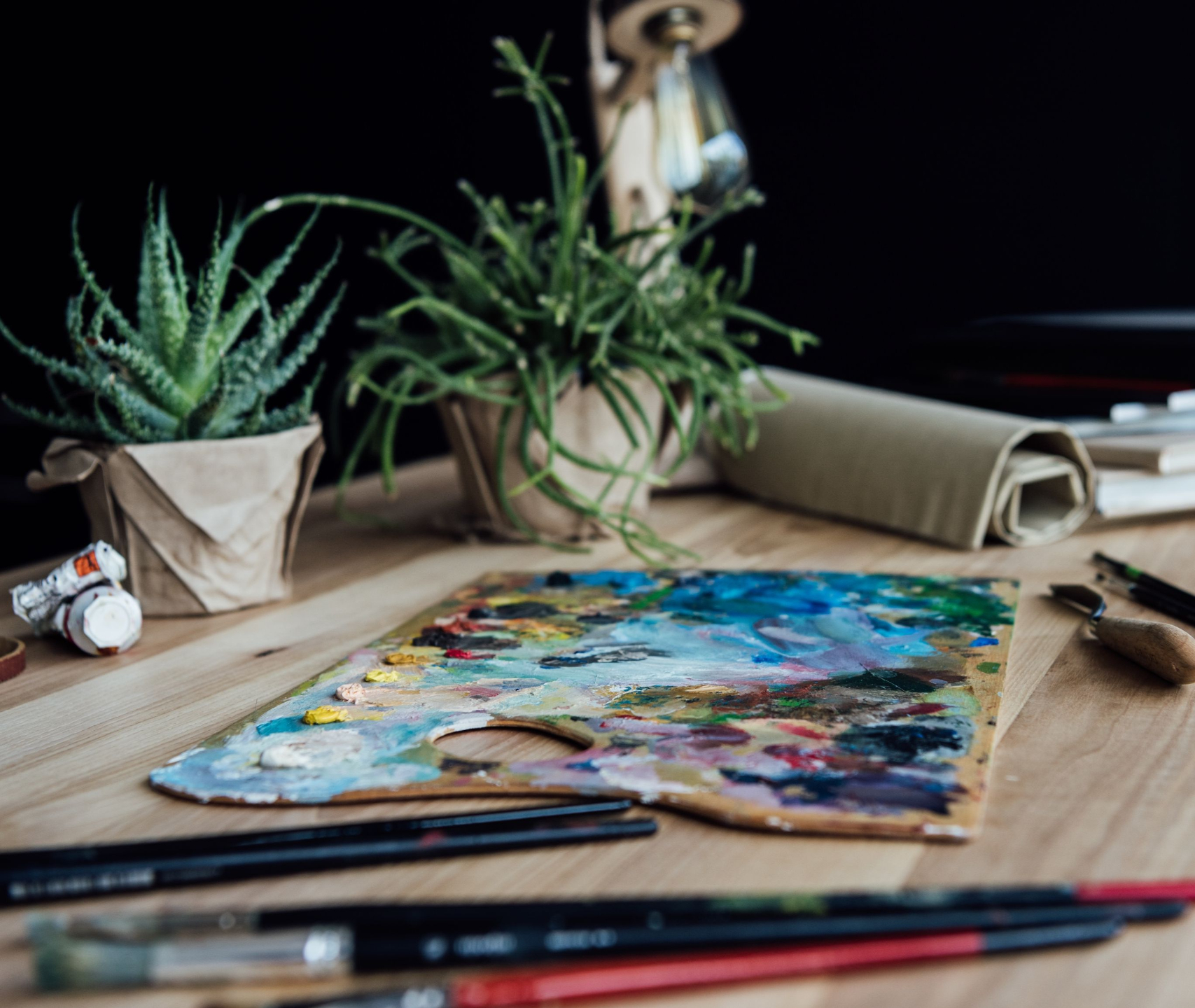
The Essential Color Mixing Studio Setup
Simple tools . A carefully chosen palette.
Everything you need to mix virtually any color with confidence.
The paints and tools used in the 1 Hour Color Mixing Pro course.

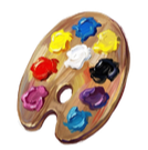
The Color Palette
Many beginner paint sets include redundant pigments or colors that limit your ability to mix clean, vibrant secondaries. When this happens, colors that should be bright and clear often turn dull or muddy. Instead of controlling the paint, you end up fighting it.
The palette used in this course is intentionally curated to avoid that problem.
Not All Primaries Mix the Same

When two colors are mixed, the result depends heavily on the specific pigments involved. Even paints that are both labeled “blue” or “yellow” can behave very differently when combined.
This happens because some pigments contain subtle color biases that introduce unwanted hues into the mixture.
This is why a color palette must be carefully chosen rather than assembled randomly.
What a Split Primary Palette Looks Like
To solve this problem, the palette used in this course follows a Split Primary system.
Instead of using only one red, blue, and yellow, the palette includes a warm and a cool version of each primary color. This expands your mixing range and allows you to produce cleaner, more vibrant secondary colors.
This structure gives you flexibility without clutter — a small set of paints that can produce an enormous range of colors.

The Palette Used in This Course
The paints below represent the warm and cool side of each primary color used in this split primary palette. They were chosen because they’re widely available and produce clean, vibrant mixtures. Together, they form a simple palette capable of mixing an enormous range of colors.
You can substitute other brands if needed — just be sure to maintain a warm and cool version of each primary color.
Titanium White
Titanium White is the backbone of any acrylic palette — especially in a split primary system. It’s the most opaque and brightest white, giving you clean tints without muddying hues. Because acrylics dry darker than they look wet, having a strong, reliable white is essential for accurately brightening mixes and controlling value.
2.00 oz View on Amazon
4.65 oz View on Amazon
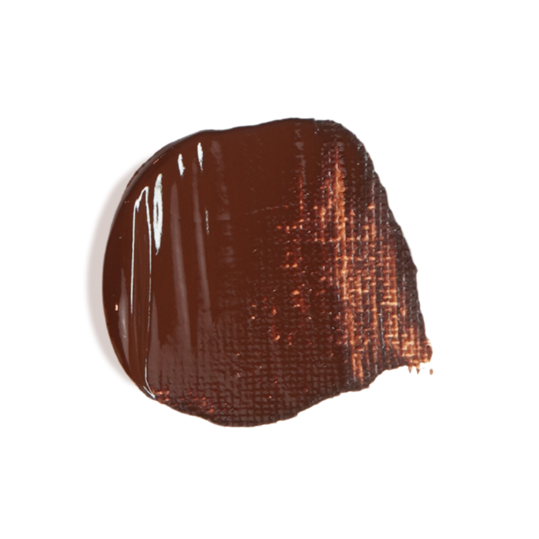
Burnt Umber
Burnt Umber is the “utility player” of this palette — incredibly versatile. It’s invaluable for creating deep shadows and near-blacks when mixed with your blues, and it desaturates colors without shifting their hue dramatically. In a system focused on mixability, it keeps your colors grounded and natural without overpowering.
2.00 oz View on Amazon
4.65 oz View on Amazon
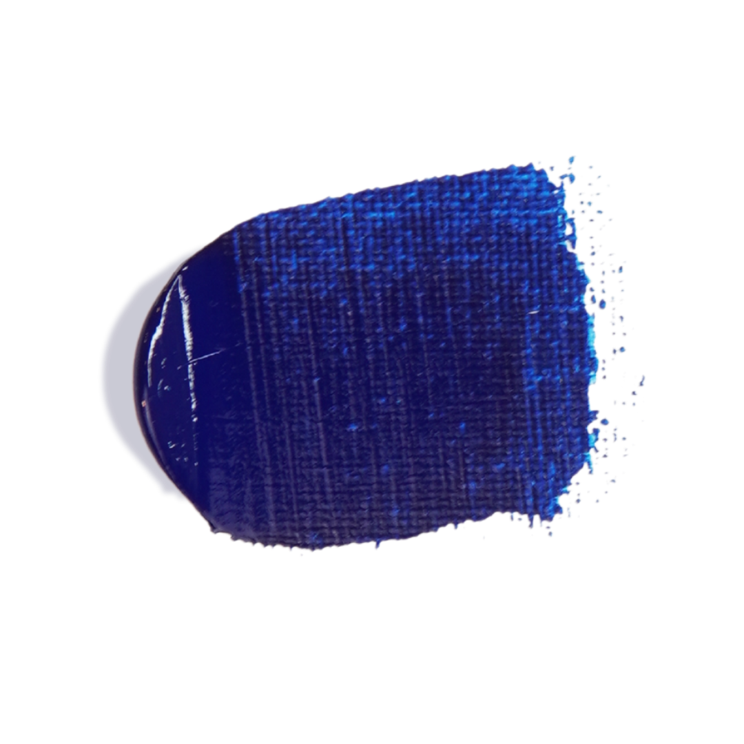
Phthalo Blue (Green Shade)
Phthalo Blue (Green Shade) brings intense tinting strength and maximum mixing range. In a split primary palette, its cool bias pairs with Ultramarine Blue to give you deep, vivid purples and clean greens without muddiness. It’s one of the most mix-friendly blues available, and it maintains brilliance even when combined with other pigments.
2.00 oz View on Amazon
4.65 oz View on Amazon
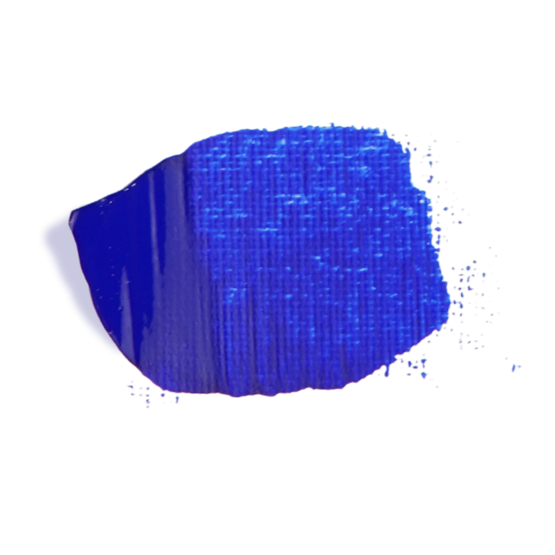
Ultramarine Blue
Ultramarine Blue provides the warm side of blue for the palette. It responds differently in mixtures than Phthalo, giving softer, more harmonious purples and muted greens. Having both blues expands your mixing range dramatically and helps you create nuanced tones without dulling your mixes.
2.00 oz View on Amazon
4.65 oz View on Amazon

Quinacridone Magenta
Quinacridone Magenta is a brilliant cool red that leans slightly toward violet — perfect for expanding your mixing possibilities. It gives vibrant purples with blues and bright, clean secondaries with yellows. Its transparency and glow make it superior for mixing lively hues without turning brown or muddy.
2.00 oz View on Amazon
4.65 oz View on Amazon
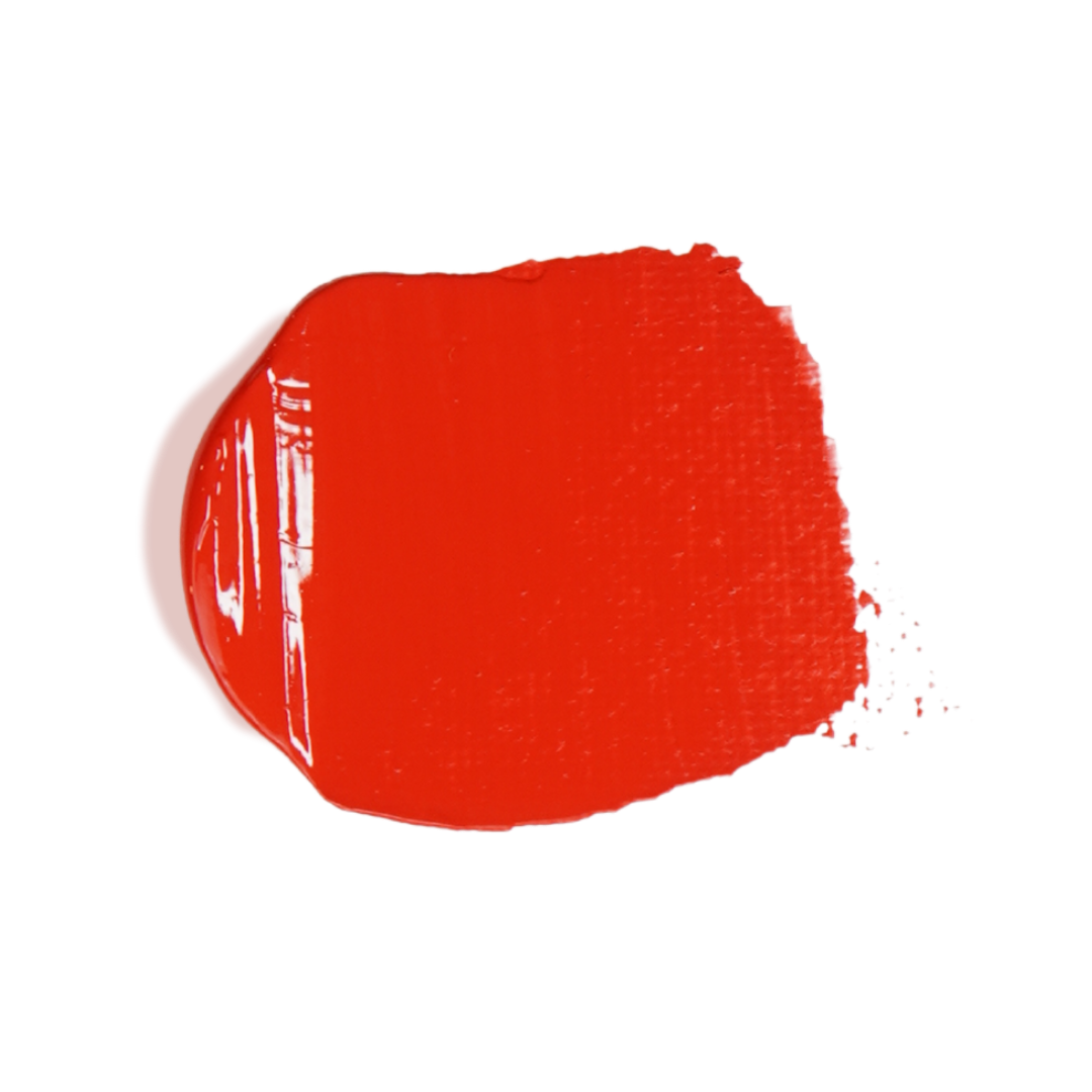
Cadmium Red Medium
Cadmium Red Medium is the warm red anchor in this palette. It brings rich, high-chromatic intensity and pairs beautifully with both yellows and blues for bright, clear secondaries. Its warmth ensures you can create vibrant oranges and clean transitions without the dullness that some cooler reds can introduce.
2.00 oz View on Amazon
4.65 oz View on Amazon
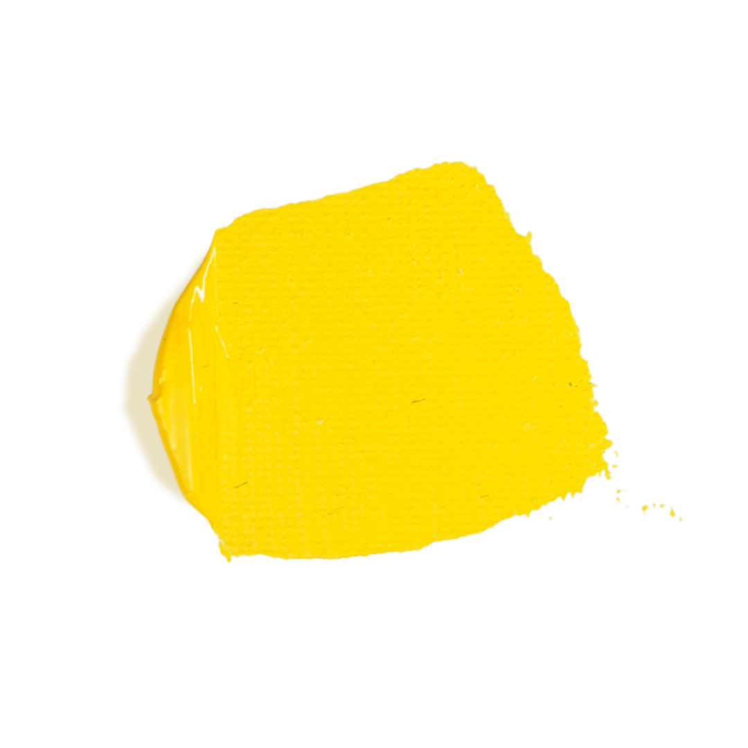
Cadmium Yellow Medium
Cadmium Yellow Medium promotes brilliance and clarity in your yellows. Its warm bias gives vivid oranges with reds and rich greens with blues when balanced properly. In the split primary model, it’s a key ingredient for maintaining high chroma in warm mixtures.
2.00 oz View on Amazon
4.65 oz View on Amazon
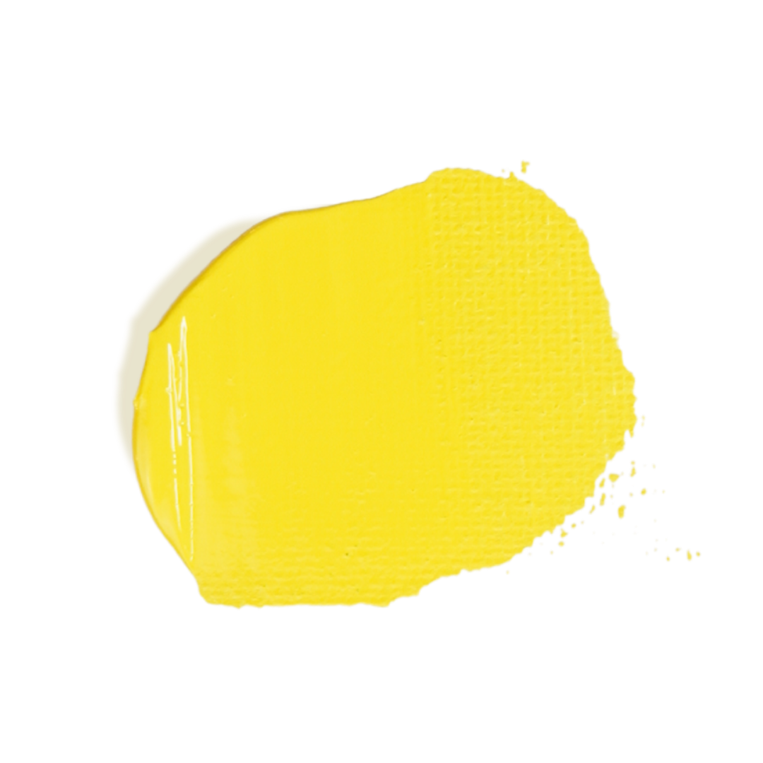
Cadmium Yellow Light
Cadmium Yellow Light gives the cool side of yellow, extending your mixing range toward greens and softening warm mixtures when needed. Its light bias helps you push toward bright, fresh hues without oversaturating, and it balances beautifully with both reds and blues for clean secondaries.
2.00 oz View on Amazon
4.65 oz View on Amazon


The Mixing Station
Once the palette is in place, the next step is setting up the mixing area.
The tools below form the backbone of a painter’s workspace. They make it easy to mix colors cleanly, test mixtures, and keep your palette organized while you work.
They’re used throughout the exercises in this course, but they’re not specific to it — these are fundamental tools that belong in every painter’s kit.

Art Paper (Watercolor Paper)
For the exercises in this course, watercolor paper or heavyweight mixed media paper works extremely well.
These papers have enough texture to hold onto acrylic paint, they resist warping better than lighter paper, and they’re affordable enough that you can practice freely without worrying about wasting expensive materials.
They provide an excellent surface for testing mixtures and building small color studies.

Palette (Palette Paper)
The palette is simply the surface where you mix your paints. There are many options available — plastic palettes, glass palettes, wooden palettes — but my personal favorite is palette paper.
Palette paper is a disposable, non-porous sheet that allows paint to mix smoothly without soaking in. When the sheet gets messy, you can simply tear it off and start fresh. There’s virtually no cleanup required, which makes it a very convenient option for both beginners and experienced painter

Color Wheel
A color wheel is one of the most useful reference tools you can have when learning to mix color. Without it, learning color relationships can feel a bit like navigating without a map.
The wheel used in this course is particularly well designed. In addition to showing color relationships, it also includes a helpful grayscale for comparing values and diagrams on the back that explain how different colors interact.
It’s a simple tool, but incredibly helpful when you’re building confidence with color mixing.

Filbert Paint Brush (Size 8)
Although this course focuses primarily on color mixing rather than painting technique, it’s still helpful to have a versatile brush available.
A medium-sized filbert brush is one of the most useful brushes a painter can own. The rounded edge allows it to create both soft strokes and controlled shapes, making it extremely versatile for a wide variety of painting situations.
If you only own one brush, a filbert like this is a great choice.
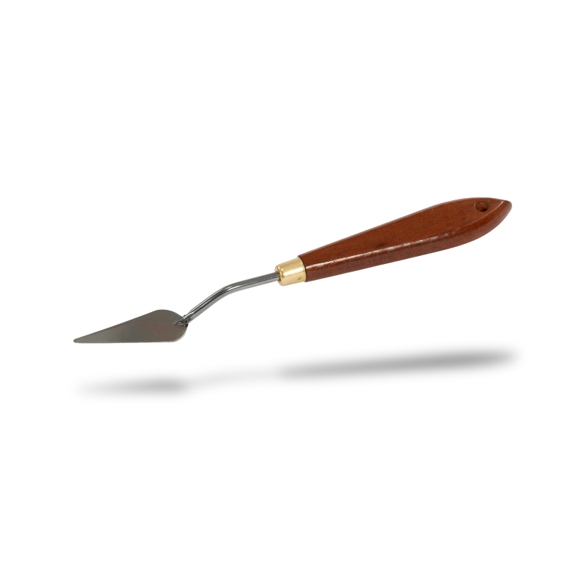
Palette Knife
A palette knife is the primary tool used for mixing paint, and I strongly recommend a mid-sized teardrop-shaped knife like the one linked here.
This shape works extremely well because it gives you several useful surfaces in one tool: the pointed tip lets you pull in small amounts of color, the broad middle section is perfect for blending paints together, and the long straight edge makes it easy to scrape and clean your palette.
It’s a simple tool, but once you start using one, it becomes an essential part of the painting process.

Studio Utilities
A few small tools can make your workspace much easier to manage while you mix colors. These items help label mixtures, hold materials in place, and keep your painting area clean as you work.

Shop Towels
Shop towels are ideal for wiping your palette knife, cleaning brushes, and keeping your mixing area tidy as you work. They are durable, absorbent, and strong enough to handle paint cleanup without falling apart.

Art Tape
Tape is a small item, but it’s surprisingly useful in the studio.
It can be used to hold palette paper in place, secure practice sheets to the table, or create clean edges when needed. It’s one of those simple tools that ends up getting used constantly.

Marker
For all-around painting needs, an acrylic paint marker is a great tool. It’s used in this course for labeling color studies and tracking mixtures, but it’s also useful in the studio for adding clean lines, notes, or small graphic details to a painting.


Bonus Studio Items
These optional tools aren’t required for color mixing, but they can make your studio setup more comfortable and efficient. Think of them as small upgrades that help your workspace run more smoothly and make the overall experience of mixing color even better.
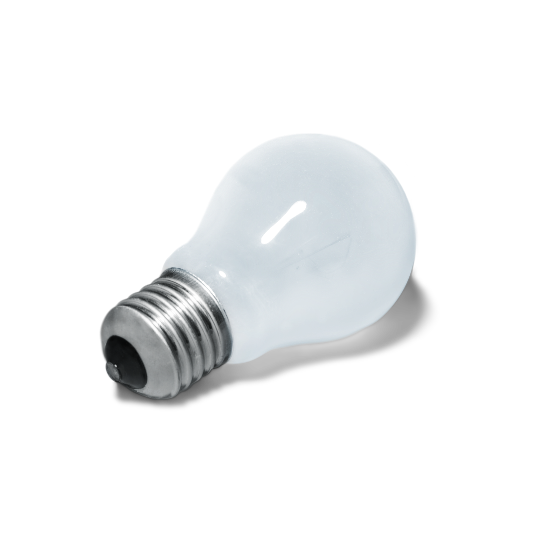
Daylight Light Bulb
Lighting plays a huge role in how we perceive color. If your workspace has dim lighting or very warm indoor lighting, it can make it harder to judge colors accurately.
A daylight-balanced bulb can help solve this problem by providing a more neutral light that makes color mixing easier to evaluate.

Post-it Notes
In one of the exercises in the course, you’ll be challenged to mix a color that perfectly matches a Post-it note.
It’s a simple but surprisingly effective color-matching exercise that helps train your eye to recognize subtle differences in hue, value, and saturation.

Stay-Wet Palette
A stay-wet palette helps keep acrylic paint workable for longer by maintaining moisture in the palette surface. This can be especially helpful if you like to mix several colors and return to them later without the paint drying out. While not necessary for the exercises in this course, many painters find it useful for longer painting sessions or when working with larger palettes.
Affiliate Disclosure: This page contains affiliate links to products I use and recommend. If you purchase through these links, I may earn a small commission at no additional cost to you.
As an Amazon Associate I earn from qualifying purchases.
These commissions help support the creation of educational resources like this course, so thank you for your support!
